


Documentation menu
Getting started
Dashboard & analytics
- Dashboard at a glance
- Cost analysis
- Pipeline performance
- Optimization insights
- Knowledge Base
- Connect your AI agent
Managed runners
- Runners overview
- Run your first job
- Migrate from GitHub-hosted
- Latchkey CLI
- The Runners page
- Custom runners (AI Scan)
- Self-healing
- Runner image & software
- Provisioning & warm pools
- Limits & concurrency
Caching
Team & notifications
Billing & plans
Help
The dashboard at a glance
The dashboard layout, every sidebar destination, the global filter bar, and the banners that tell you what Latchkey is doing in the background.
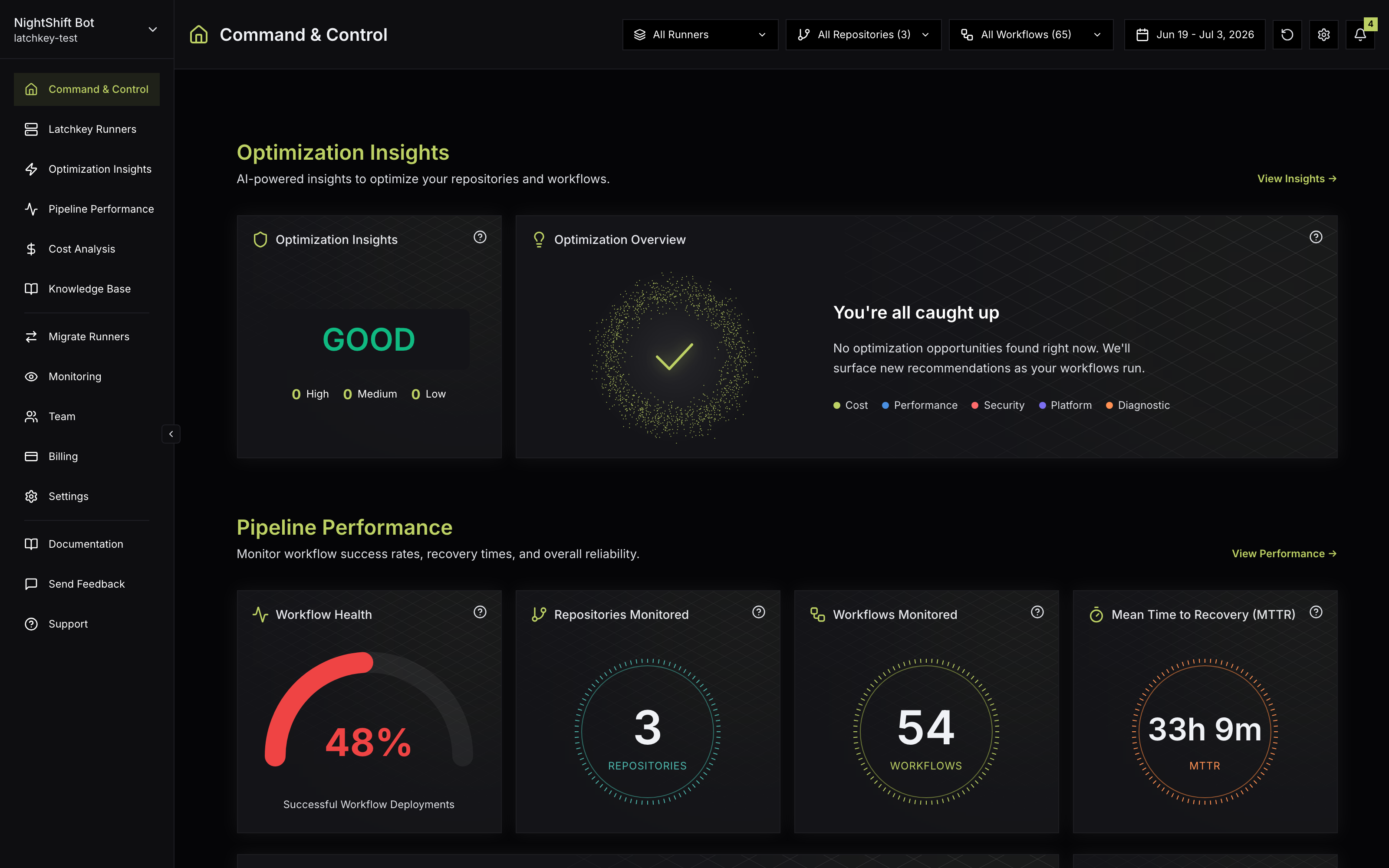
The dashboard has three standing parts: the sidebar (where you go), the filter bar (what data you are looking at), and the page itself. This guide covers all three, plus the banners Latchkey uses to tell you what is happening in the background.
The sidebar#
Every destination in one place. Entries marked admin are only visible to workspace owners and admins; everyone else sees the rest.
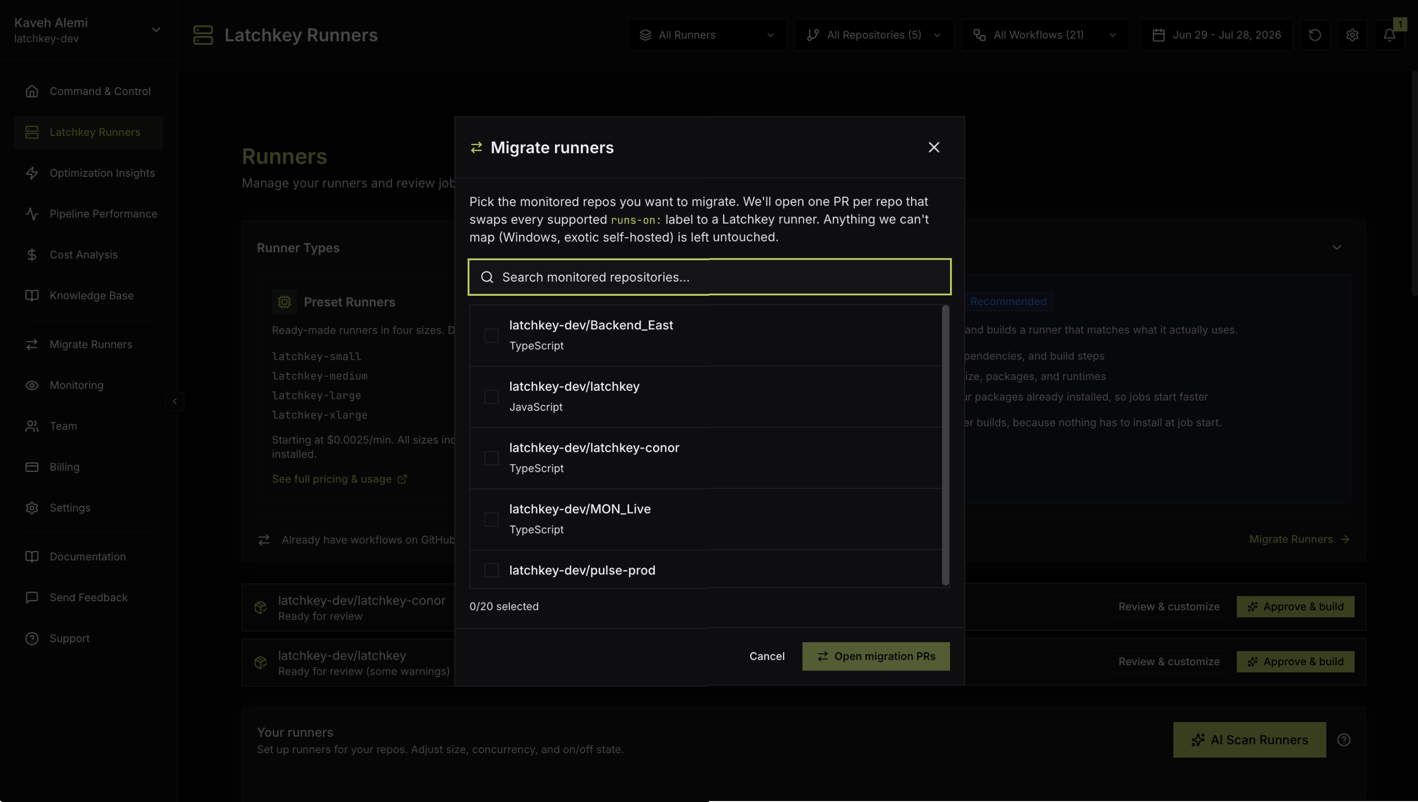
Below those, the sidebar links to this documentation, a Send Feedback form (a modal), and support.
The filter bar#
Every analytics page shares one filter bar at the top:
- Runner type selector: All Runners, Latchkey Runners, or GitHub Runners.
- Repository and Workflow multi-selects. The repository picker adds search, select-all, and clear-all. Analytics pages show data for the repositories and workflows you select; if nothing is selected, pages prompt you to pick a repository first.
- Date range picker with 7D, 30D, 90D, 1Y, and YTD presets plus a custom calendar range. The default window is the last 14 days, and every analytics page shares the same picker.
- Reset filters to go back to defaults in one click.
- Display settings (gear icon) with a "Show decimals" toggle that switches between rounded and precise values.
- Notification bell with your in-app notification history.
How the filters compose#
The selectors all narrow the same result set: runner type, repository, and workflow act together, and the date range bounds the window everything is computed over. Selecting one repository and one workflow, then tightening the date range, is the standard way to isolate a single pipeline's behavior over a specific stretch of time. Because every analytics page shares the same bar, the scope you set applies wherever you navigate next: the cost you see on Cost Analysis and the durations you see on Pipeline Performance describe the same slice of your CI.
No repository selected
- Analytics pages do not guess a scope for you
- You are prompted to pick a repository first
- Pick one from the Repository selector to populate the page
Repositories selected
- Pages show data for exactly the repositories and workflows you chose
- Narrow further with the workflow selector and date range
- Reset filters takes you back to defaults in one click
If a repository you expect is missing from the selector, it is most likely not monitored yet. Monitoring is managed by owners and admins from the Monitoring modal; see Managing repositories.
Fullscreen charts and live refresh#
Two behaviors worth knowing about the data on screen. Every chart expands to a fullscreen view with the filter bar still available, so you can slice and present in the same view without losing your scope. And the page refreshes automatically, shortening its refresh interval while any workflow is in progress: during active CI runs, results land in near real time with no manual reload.
Banners worth knowing#
- Backfill progress: shows while historical data for a newly enabled repository is importing.
- Free tier warning: appears when you have used 80% (and again at 100%) of your included runner minutes.
- Trial notices: a countdown when your trial is ending, and a full-screen prompt to subscribe once it has ended.
None of these require action to keep the dashboard working; they are Latchkey narrating its own background work. Each one has a natural next stop when you want more detail:
| Banner | What it tells you | Where to go next |
|---|---|---|
| Backfill progress | Historical runs for a newly enabled repository are still importing | Managing repositories explains what backfill covers |
| Free tier warning | You have used 80% (then 100%) of your included runner minutes | Runner usage and free minutes |
| Trial notices | Your trial is ending, or has ended | Plans and trial |
Command & Control (Overview)#
The Overview leads with what Latchkey did for you and what is waiting on your decision, then compresses performance and cost below it. Three sections, top to bottom, each linking to its full page:
- AI Insight (link "View AI Insight"): the header reads "See what self-heal fixed automatically and the savings ready to apply." A split hero shows Self-heal, last 30 days on the left, the count of failures repaired on the runner with an Autonomous badge, and Insight, ready to apply on the right, the count of findings ready to apply, with pillar dots for security, reliability, adoption, and cost and an open-findings badge. Below the hero, the top three open findings appear as cards with their actions: Preview, a one-click apply such as Pin to SHA, Dismiss, or Investigate. When nothing is open, the section reads "You are all caught up."
- Pipeline Performance (link "View Performance"): Workflow Health as a gauge captioned "Successful Workflow Deployments", Repositories Monitored and Workflows Monitored counts, Mean Time to Recovery (MTTR), a Workflow Health Summary (Total Runs, Average Duration, Fail Rate, Cancel Rate, Rebuild Success Rate), and Failed Deployments with the failed-run count and most failing workflow, or "No failures detected" when there are none.
- Cost Analysis (link "View Cost Analysis"): Theoretical Cost with a week-over-week badge, Highest Spend (Theoretical) with top repositories linking to GitHub, a GitHub KPI stack (forecasted billable cost by end of cycle, or "Not enough data yet - run more jobs for a forecast", plus free-tier minutes remaining and used this cycle), Total Billable Cost Over Time with a dotted forecast extension, and a Latchkey KPI stack labeled "Current billing period".
Reading the Overview in 60 seconds#
The Overview is built to be scanned, not studied. Here is one way to make a quick pass a habit; the order is a suggestion, not a product requirement:
Read the AI Insight hero
Two numbers set the tone. The left number is what self-heal already fixed on its own; it needs nothing from you. The right number is findings waiting on your approval; if it is not zero, that is your first stop. The full queue lives on AI Insight.
Clear what you can in place
The top three open findings sit right below the hero with their one action on the card. Preview shows the exact change before you apply; Dismiss clears what does not apply to you. A minute here often empties the queue without leaving the Overview.
Scan the performance cards
Look at the Workflow Health gauge, MTTR, and the fail rate in the Workflow Health Summary. You are not looking for absolute numbers; you are looking for movement versus what is normal for your team. Anything surprising, follow the section link into Pipeline Performance.
Read the cost trend
The week-over-week badge on Theoretical Cost is your fastest "is spend drifting?" signal. Glance at the top-spend repositories and the forecasted billable cost for the cycle; free-tier minutes are tracked in the same stacks, and a banner will also warn you at 80%. The full story lives on Cost Analysis.
Click through the one section that moved
Each Overview section links to its full page. A useful discipline: pick the single section that changed the most since your last look and go deep on that one, instead of skimming all three.
What does the dashboard filter bar apply to?
One shared filter bar (runner type, repository, workflow and date range) scopes every analytics page at once, so a filter you set on one page is still in effect when you move to another. Charts opened fullscreen keep the same filters.
How often does dashboard data refresh?
Automatically, and faster while workflows are running, so you do not need to reload during a build. If a page looks empty, that is usually the filter bar or a backfill still importing, not missing data.
What are the banners at the top of the dashboard?
They narrate background work rather than errors: backfill progress while historical runs import, free-tier warnings as you approach the monthly minute allowance, and trial notices. Every blocked state has an explicit tell, so a silent dashboard is not a blocked one.