


Documentation menu
Getting started
Dashboard & analytics
- Dashboard at a glance
- Cost analysis
- Pipeline performance
- Optimization insights
- Knowledge Base
- Connect your AI agent
Managed runners
- Runners overview
- Run your first job
- Migrate from GitHub-hosted
- Latchkey CLI
- The Runners page
- Custom runners (AI Scan)
- Self-healing
- Runner image & software
- Provisioning & warm pools
- Limits & concurrency
Caching
Team & notifications
Billing & plans
Help
Cost analysis
Understand theoretical vs billable cost, track free-tier minutes for GitHub and Latchkey, and find your most expensive repositories and workflows.
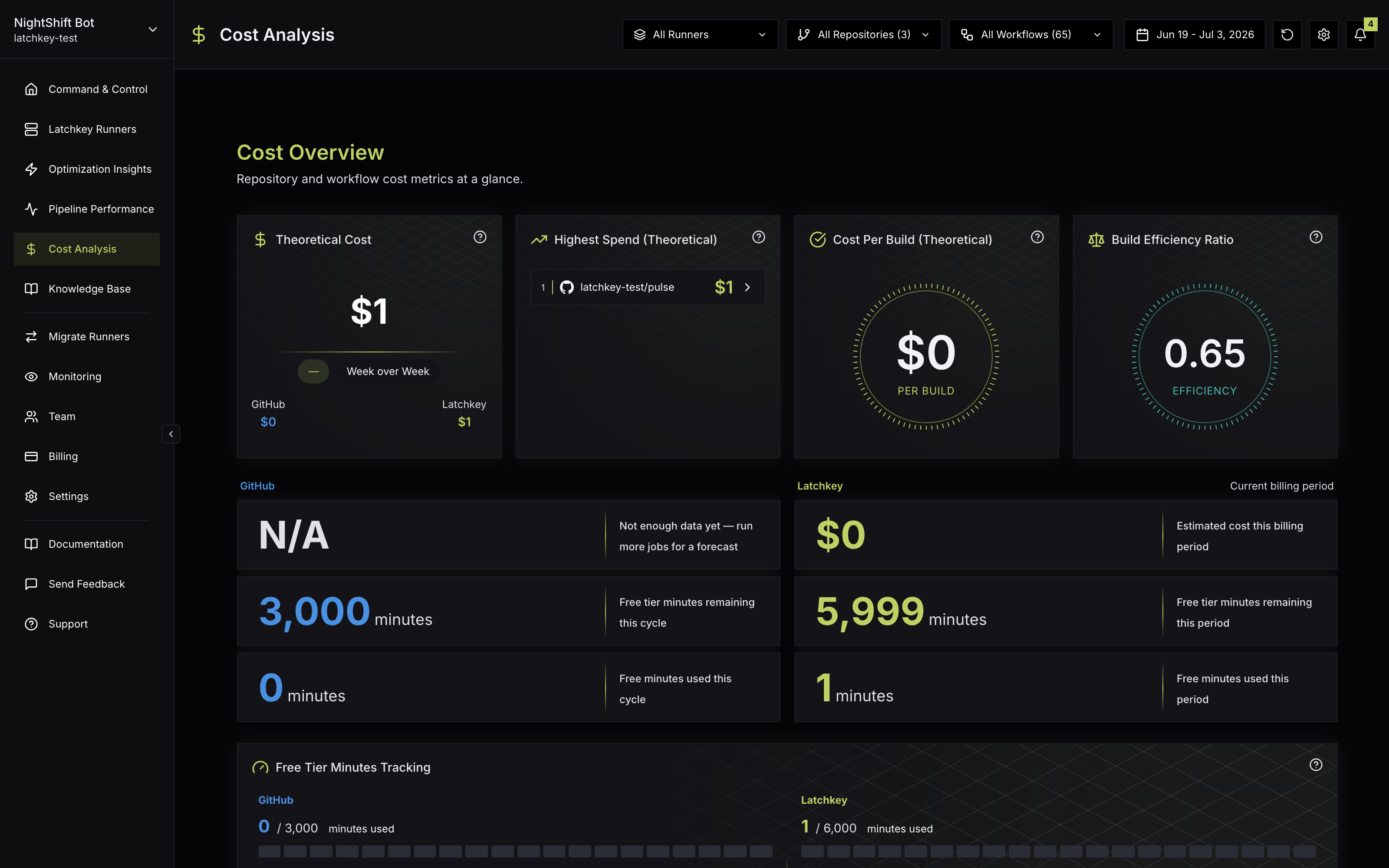
The Cost Analysis page answers "where does our CI money go?" for both GitHub-hosted and Latchkey runners.
The page is organized into three sections: Cost Overview (the headline KPIs), Cost Analysis (the charts you drill into), and Latchkey Runner Costs (what your managed runners are costing this billing period). Before any of that is useful, though, you need the distinction the whole page is built on.
Two numbers to understand#
Theoretical cost
- What your usage would cost at standard per-minute rates
- Split between GitHub-hosted and Latchkey runners
- Not distorted by free minutes: the number to watch for trends
Billable cost
- What you are actually charged
- After free tiers and plan inclusions are applied
- The number that matches your invoice
Why two numbers? Free tiers absorb the first slice of your usage, which makes billable cost a poor trend signal: it can sit near zero for part of a period and then climb steeply once free minutes run out, even when your actual usage grew smoothly. Theoretical cost moves in proportion to usage, so it is the one to read when you ask "are we using more CI than last month?" Billable cost is the one to read when you ask "what will we pay?"
Cost Overview section#
- Theoretical Cost with a week-over-week trend badge and the GitHub vs Latchkey portions labeled underneath. The trend badge compares billable cost for the last 7 days against the previous 7 and shows a dash until two full weeks of data exist.
- Highest Spend (Theoretical): your top 3 repositories by modeled cost for the selected period.
- Cost Per Build and Build Efficiency Ratio to normalize spend against output. Cost per build is the average theoretical cost per successful build; efficiency ratio is build success rate relative to theoretical cost, so higher means more successful builds per dollar.
- GitHub and Latchkey KPI stacks: the GitHub stack shows forecasted billable cost by end of cycle plus free-tier minutes remaining and used this cycle; the Latchkey stack, labeled "Current billing period", shows estimated cost this billing period plus free-tier minutes remaining and used this period.
- Free Tier Minutes Tracking: segmented gauges for GitHub-included minutes and Latchkey-included minutes side by side, with the limits reflecting your own plan allotments.
A word on Cost Per Build: total cost rises whenever your team ships more, which is usually good news, not a problem. Cost per build strips volume out of the picture. If total cost is up but cost per build is flat, you are simply building more. If cost per build itself is rising, each build got more expensive: longer runs, bigger runners, or new steps, and that is the trend worth investigating.
The forecast deserves a note too. Once the current month accumulates enough usage history, the GitHub KPI stack projects billable spend through the end of the billing cycle as Forecasted billable cost by end of cycle, based on your month-to-date spend pattern. Until then, the card reads "Not enough data yet - run more jobs for a forecast". Either way, you see where the month is heading while there is still time to react.
Cost Analysis section#
- Cost Over Time: daily billable and theoretical cost as two series over your selected date range.
- Repository Costs: theoretical and billable cost per repository, with a Top 5 / Bottom 5 dropdown. Repository names link directly to GitHub, so you can go from a cost spike to the workflow files behind it in one click.
- Cost by Runner OS: a donut of spend across Linux, Windows, and macOS, separating Linux (GitHub) from Linux (Latchkey) when both exist.
Two reading tips for this section. On Cost Over Time, the point where the billable line starts tracking the theoretical line is the point your free-tier minutes ran out; before that, free minutes were absorbing the difference. And on Cost by Runner OS, remember that GitHub charges a premium for Windows and macOS minutes, so a large Windows or macOS slice is often a list of jobs worth moving to cheaper Linux runners.
Latchkey Runner Costs section#
If you run jobs on managed runners, this section appears with a per-configuration cost table: Config Name (with the runner label you use in workflow files, such as latchkey-small), a Custom or Preset type badge, Jobs, Avg Duration, and Cost for the selected period. When free minutes were used, a footer shows "Free tier applied: X / Y min" and the dollar value saved. Latchkey runner cost KPIs always reflect the current billing period, independent of the date-range filter.
Above the table, a callout reads "Estimated savings vs GitHub-hosted: $X": the dollars your team saved by running jobs on Latchkey runners instead of comparable GitHub-hosted runners for the selected period. It appears whenever the savings are positive.
CLI Jobs line#
If your team runs one-off jobs from the Latchkey CLI or the MCP run_job tool, that spend appears as its own CLI Jobs line, with the period's spend and job count. These jobs belong to no repository and no workflow, so this line is the money the repository breakdown cannot place; it is still part of Theoretical Cost. The line hides while a repository or workflow filter is active or when the runner-type filter is set to GitHub only, and it disappears entirely in periods with no CLI jobs.
Filters on this page#
The shared filter bar works here the way it does everywhere: runner type, repository and workflow multi-selects, the same date range picker with its 7D, 30D, 90D, 1Y, and YTD presets plus a custom range, and reset. Every chart also opens in a fullscreen mode that keeps the filter bar, and the display settings gear has a "Show decimals" toggle that switches dollar figures between cent precision and rounded whole dollars. The one exception to the date filter: Latchkey runner cost KPIs always reflect the current billing period.
Which chart answers which question#
| You want to know | Look at |
|---|---|
| Is CI spend trending up or down? | Theoretical Cost and its week-over-week trend badge |
| Which repositories cost the most? | Highest Spend (Theoretical), then Repository Costs with the Top/Bottom switch |
| Did spend grow because we build more, or because builds got pricier? | Cost Per Build and Build Efficiency Ratio |
| When exactly did the spike happen? | Cost Over Time, with the date range narrowed around it |
| What will the invoice look like? | The GitHub and Latchkey KPI stacks (forecasted billable cost for the period) |
| How close are we to using up free minutes? | The Free Tier Minutes Tracking gauges |
| Is one operating system driving the bill? | Cost by Runner OS |
| What is each runner size costing us? | The per-configuration table under Latchkey Runner Costs |
| What did our one-off CLI and agent jobs cost? | The CLI Jobs line |
Using this page to actually cut cost#
A suggested routine when spend needs to come down. Nothing here is enforced by the product; it is simply the order in which the charts answer each other's questions:
Establish the trend
Start with Theoretical Cost and its week-over-week badge. If the trend is flat, you are optimizing a stable bill; if it is climbing, you are chasing a change, and the rest of the pass is about finding when and where.
Find the concentration
Open Highest Spend (Theoretical) and Repository Costs. CI spend is usually concentrated: a small number of repositories tend to carry most of the bill, so effort spent on the top of this chart pays off far more than anywhere else.
Separate volume from price
Check Cost Per Build. If it is flat while total cost rises, the team is shipping more and the honest fix is budget, not optimization. If it is rising, individual builds got more expensive and there is real waste to find.
Isolate the pipeline
Use the repository and workflow filters to zoom into one candidate, and read Cost Over Time for the selected range. This usually pinpoints the day a spike started and the workflow responsible.
Act on it
Check AI Insight: nightly analysis surfaces quantified cost findings, each with one action Latchkey can take for you (downsizing an oversized runner, adding caching), applied as a pull request you approve. If the issue is free-tier exhaustion rather than waste, see Runner usage and free minutes and Managing billing.
Metric reference#
| Metric | What it tells you |
|---|---|
| Theoretical Cost | Combined cost of all CI usage in the selected range, GitHub-hosted plus Latchkey, priced before free minutes |
| Week over Week | Percent change in billable cost, last 7 days vs the 7 days before; a dash until two full weeks of data exist |
| Cost Per Build (Theoretical) | Average theoretical cost per successful build, before free tier |
| Build Efficiency Ratio | Build success rate relative to theoretical cost; higher means more successful builds per dollar |
| Forecasted billable cost by end of cycle | Projected GitHub billable spend through month end; "Not enough data yet" until history accumulates |
| Free Tier Minutes Tracking | "X / Y minutes used" gauges for your GitHub plan and your Latchkey plan, side by side |
| Cost Over Time | Daily billable and theoretical cost; where the billable line starts tracking the theoretical line is where free minutes ran out |
| Cost by Runner OS | Spend split across Linux, Windows, and macOS, with Linux (GitHub) and Linux (Latchkey) slices when both exist |
| Estimated savings vs GitHub-hosted | Dollars saved by running jobs on Latchkey runners instead of comparable GitHub-hosted runners; shown when positive |
| Free tier applied: X / Y min | Latchkey free minutes applied against your plan's included minutes, and their dollar value, in the runner-costs table footer |
| CLI Jobs | Spend and job count for jobs started from the Latchkey CLI or the run_job MCP tool; they belong to no repository, so they show here and inside Theoretical Cost, not in the repository breakdown |
To model spend before it lands on this page - a new repo, a bigger runner, more jobs - use the GitHub Actions cost calculator on Learn, or browse the CI cost guides for pricing mechanics across providers.
What is the difference between theoretical and billable cost?
Theoretical cost is your usage priced at list rates, which makes it the clean trend signal because it ignores free tiers and discounts. Billable cost is what you are actually charged after those are applied. Watch theoretical to see whether usage is growing; watch billable to see what you owe.
Why do the Latchkey runner cost figures ignore my date filter?
The Latchkey runner cost KPIs always reflect the current billing period, whatever range the filter is set to. They answer what you owe this cycle, which is a billing-period question, not a date-range one. The GitHub cost charts do follow the filter.
When does the spend forecast appear?
Once enough usage history has accumulated in the current cycle to project from. The forecast estimates GitHub billable spend through the end of the billing period; early in a cycle there is not enough signal, so it stays hidden rather than showing a number you should not trust.