


Documentation menu
Getting started
Dashboard & analytics
- Dashboard at a glance
- Cost analysis
- Pipeline performance
- Optimization insights
- Knowledge Base
- Connect your AI agent
Managed runners
- Runners overview
- Run your first job
- Migrate from GitHub-hosted
- Latchkey CLI
- The Runners page
- Custom runners (AI Scan)
- Self-healing
- Runner image & software
- Provisioning & warm pools
- Limits & concurrency
Caching
Team & notifications
Billing & plans
Help
Pipeline performance
Build durations, success and failure rates, MTTR, recent workflow runs, and where self-healed runs show up.
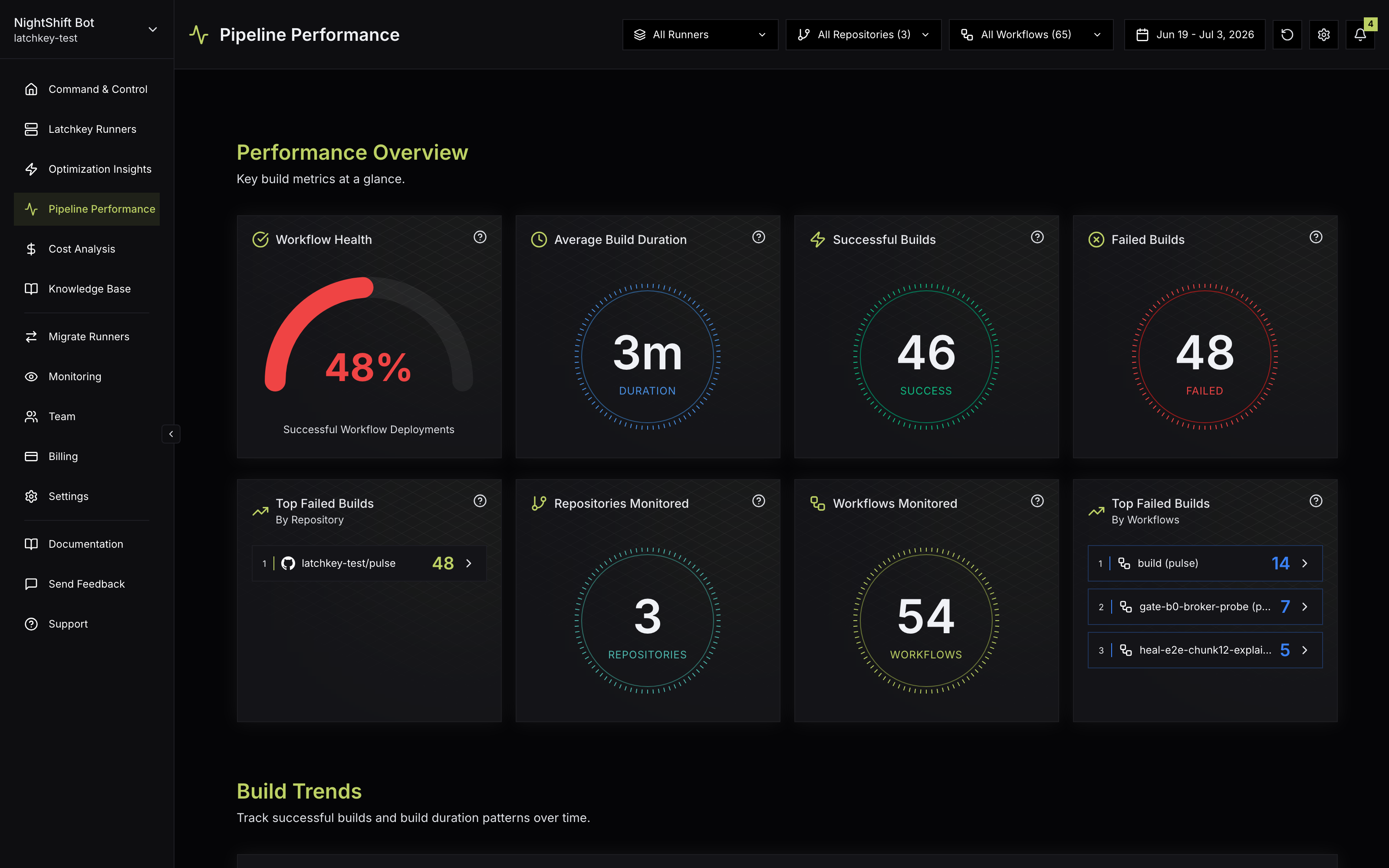
The Pipeline Performance page tracks how healthy and how fast your workflows are.
There are two ways to use it. As a monitor, you glance at the overview and trends to answer "is CI getting better or worse?" As an investigation tool, you filter down to one repository or workflow and use the runs table and recovery metrics to answer "what exactly happened, and how did we handle it?" The sections below are laid out roughly in that order.
Performance Overview#
- Workflow Health: overall success rate as a gauge.
- Average Build Duration, Successful Builds, and Failed Builds for the selected window.
- Top Failed Builds: the three repositories and the three workflows with the most failed builds. Every entry links straight to the repository or the workflow file on GitHub, so you can jump from the hotspot to the fix.
- Repositories Monitored and Workflows Monitored counts, confirming exactly what the numbers cover.
Guidance for reading the gauge: a single bad day rarely means much; one broken merge can sink a day's success rate on its own. What deserves attention is a sustained drop across the window, or a gap between repositories: if one repo's health sits far below the rest, Top Failed Builds will usually name the workflow responsible, and its deep-link takes you straight to the workflow file on GitHub.
Build Trends#
- Successful Builds Over Time by Repository: the daily trend of successful builds, one line per repository.
- Average Build Duration by Repository and Workflow Duration: bar charts ranking repositories and workflows by average duration, each with a Top 5 / Bottom 5 dropdown. Chart labels link to the repository or the workflow file on GitHub.
- Build Duration Trend Across Workflows to spot pipelines that are getting slower.
Duration trends come in two shapes worth telling apart. A step change (duration jumps on a specific day and stays there) almost always traces back to a concrete edit: a new step, a dependency change, a different runner. A slow creep is the quieter problem: growing test suites and accumulating steps that nobody notices week to week. The trend charts exist to make the creep visible. Latchkey's nightly reliability detectors watch the same run history: a sustained run-time regression surfaces as a reliability finding on AI Insight, with the evidence one click away.
Recent Workflow Runs#
The Workflow Runs table is a single feed of individual runs across all your repositories: status icon, timestamp, repository, workflow, branch, and duration. Every column sorts, the default order is most recent first, and runs paginate at 13 per page. Clicking a row opens the run on GitHub.
When Latchkey's self-heal repairs a run, the table shows a green Healed badge in the Heal column. Click it to open the Heal Details drawer on the Runners page: what failed, the diagnosis, and the exact action taken in plain language; for AI-diagnosed failures it also includes the agent's iterations. That matters when reading this page because a healed run counts as a rescue, not a clean pass: if the same workflow keeps needing heals, the underlying flakiness is still there to fix. See Self-healing for how healing works and the Runners page for the full Recent Heals feed.
Recovery & Comparative Analysis#
- Build Fail Rate and Rebuild Success Rate: how often builds fail, and how often a re-run goes green.
- Mean Time to Recovery (MTTR) and MTTR Over Time: the average time between a failed build and the next successful build, paired with its daily trend.
- Build Status by Repository: successful, failed, and cancelled builds per repository in a stacked bar chart, with a Top 5 / Bottom 5 dropdown.
What each recovery metric tells you#
MTTR is the average time between a failed build and the next successful build. It measures your team's whole recovery loop: noticing the red build, diagnosing it, and landing the fix. There is no universal "good" number; a team deploying many times a day needs MTTR measured in minutes, while a weekly-release team can tolerate hours. What is universally bad is a rising MTTR Over Time trend: it means failures are getting harder to diagnose, or the team is getting slower to respond, and either one compounds.
Rebuild Success Rate is the flakiness detector. It tells you what fraction of failures disappear when you simply run the build again, and the two extremes point at very different problems:
High rebuild success rate
- Most failures vanish on re-run: they were transient
- Points at flaky tests, network hiccups, or fragile setup steps
- Convenient day to day, but retries are masking reliability debt
- The fix is stabilizing the flaky thing, not retrying harder
Low rebuild success rate
- Failures stay red on re-run: they are real
- Points at genuine code or configuration regressions
- Your fail rate is telling the truth about code quality
- The fix lives in the changes being merged, not in CI
Build Fail Rate only becomes meaningful next to rebuild success rate. A 10% fail rate made of real regressions and a 10% fail rate made of flaky re-run-and-forget failures are entirely different problems, and this page gives you both numbers precisely so you can tell them apart.
Metric glossary#
| Metric | What it measures | How to read it |
|---|---|---|
| Workflow Health | Overall success rate for the selected window, shown as a gauge | Watch sustained movement, not single-day dips |
| Average Build Duration | Mean run duration across your selected scope | The trend matters more than the absolute number |
| Build Fail Rate | How often builds fail | Interpret it together with rebuild success rate |
| Rebuild Success Rate | How often a re-run of a failed build goes green | High = transient/flaky failures; low = real regressions |
| MTTR | Average time between a failed build and the next successful build | Measures your detect-diagnose-fix loop end to end |
| MTTR Over Time | MTTR as a trend across the window | Direction matters most; a rising line compounds |
A suggested weekly review (adapt to taste)
What is a Healed badge on a workflow run?
A green Healed badge means self-healing repaired something during that run. Selecting it opens the Heal Details drawer, which shows what failed, what was applied and whether the step then succeeded, so a heal is auditable rather than something that quietly happened.
Which metric should I watch to catch CI getting slower?
Build Trends, not the current duration. Trends catch slow creep over weeks, which is how most pipelines degrade; a single slow run is noise. Use Top Failed Builds for the opposite problem, the active fires that need attention today.
What do MTTR and rebuild success rate mean here?
MTTR is the mean time from a failing run to the next successful one on the same workflow, so it measures recovery rather than failure. Rebuild success rate is the share of reruns that pass; a low rate means reruns are not fixing anything and the failure is real, not flaky.